
How Color and Light Transformed a Headquarters in Mozambique
Many headquarters focus on looking professional. Fewer succeed in making people feel energized when they walk through the door. For RBOBRAS in Mozambique, the priority was different. The company needed a workplace that could support daily operations while actively lifting employee mood and sustaining productivity over long days. M&W responded with a design that treated natural light and color as core tools rather than finishing touches.
The finished headquarters feels bright, purposeful and human. Furniture here does more than fill space. It shapes how people experience their work.
Project Context and Goals
The RBOBRAS headquarters sits in Mozambique, a region that enjoys strong natural light for much of the year. Rather than limiting or covering that light, the design treated it as a primary asset. The brief asked for a complete office environment capable of supporting focused individual work, active collaboration and short recovery moments throughout the day.
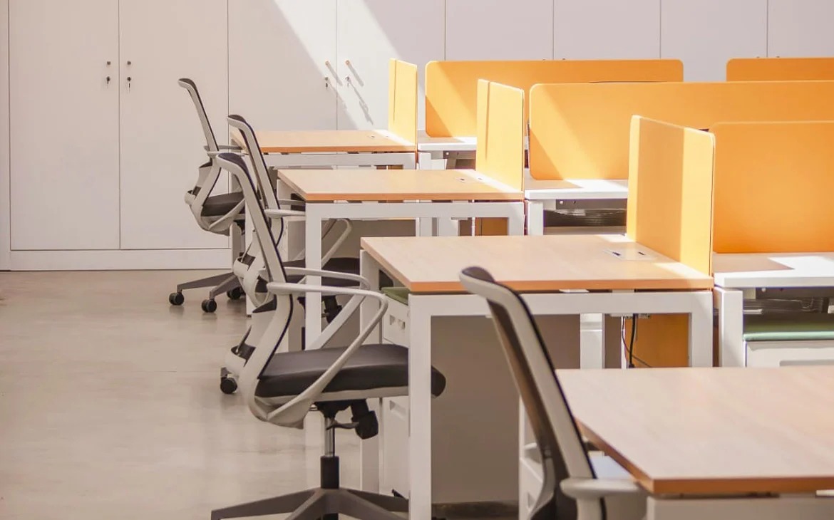
M&W delivered a coordinated furniture system that included ergonomic workstations, glass partition walls and lounge seating. Color was applied deliberately to create distinct emotional zones across the floor. This approach, sometimes called chromatic motivation, turns color into a practical workplace tool instead of a purely decorative decision.
The real aim went beyond making the space look modern. It was to shape how people felt and performed from the moment they arrived until the end of the workday.
Using Light and Color as Design Drivers
Natural light was kept as open as possible. Glass partition walls allowed daylight to move deeper into the floor while still defining clear functional areas. This combination of transparency and structure helped the headquarters avoid the closed-in feeling common in denser layouts.
A purposeful color palette was introduced at the same time to support different kinds of activity:
|
Zone Type |
Color Used |
Primary Purpose |
|
Focused workstations |
Teal |
Calm concentration and long tasks |
|
Collaborative areas |
Sunrise yellow |
Energy and team interaction |
|
Breakout / recovery |
Citrus accents |
Short pauses and mental reset |
These choices make the purpose of each zone easier to read at a glance. People do not need heavy signage to understand where focused work happens and where conversation is welcome. The colors themselves guide both behavior and mood.
Why Color Influences Daily Work
In busy workplaces the visual environment affects energy levels more than many teams expect. Cooler tones such as teal create a sense of steadiness for prolonged desk work. Warmer tones such as yellow and citrus stimulate interaction and provide emotional contrast. When these colors appear consistently across furniture, the floor begins to operate as one coordinated system rather than a set of unrelated pieces.
How the Floor Was Organized
Focused Work Areas
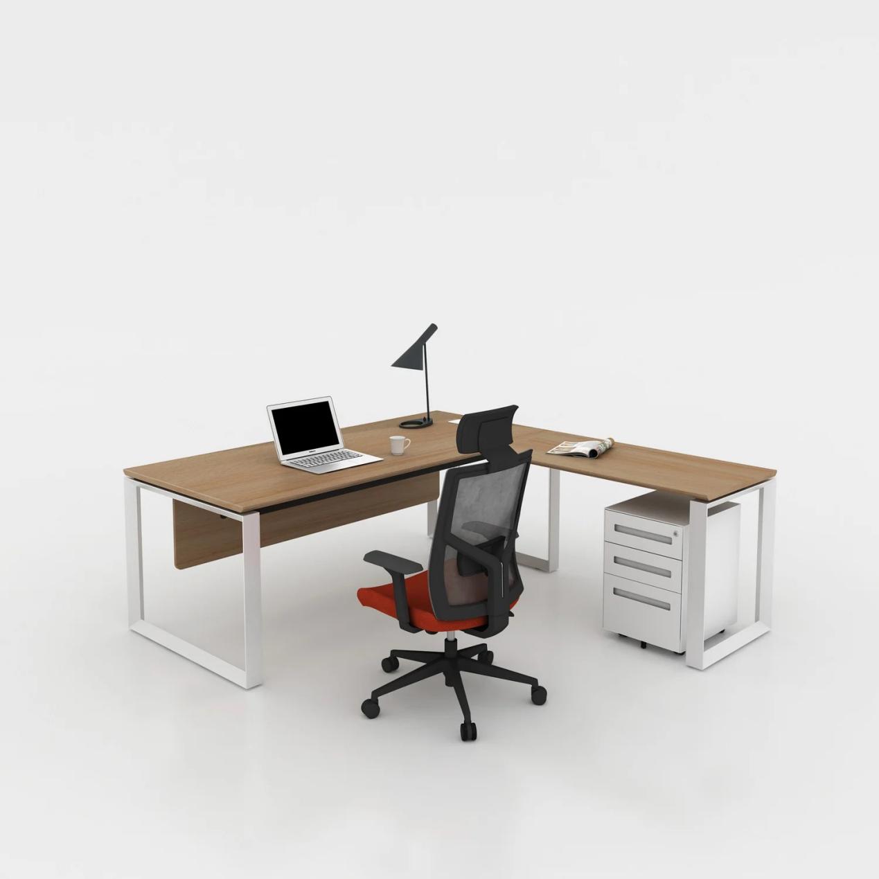
The main workstation zones use teal ergonomic stations. The color feels steady and professional while still contributing to the bright overall character of the headquarters. These areas support sustained concentration without making the space feel heavy. Ergonomic detailing further helps people stay comfortable during long working hours. Comparable modular options appear across our range of modular desk systems.
Collaborative Zones
Sunrise-yellow tables identify the places intended for discussion and joint work. The warmer tone clearly signals that these are active, interactive areas. The contrast with the teal workstations helps people shift more naturally between focused and collaborative modes. This visual distinction reduces the need for rigid rules about where certain activities belong.
Breakout and Recovery Spaces
Citrus-accented breakout zones furnished with office sofas give employees places to step away for a few minutes. These areas stop the entire floor from feeling like continuous high-intensity work. They support mental recovery during long days and give teams informal places to connect outside formal meetings. The softer furniture and lighter palette make these zones feel distinctly different from the primary work areas.
Glass Partition Walls
Glass partitions create necessary boundaries while preserving visual connection and light flow. Different activities can take place side by side without the space feeling fragmented or dark. The transparency also helps the headquarters keep its open character, which is especially valuable in a climate that offers abundant natural light.
Products Used in the Project
Several key elements work together as a complete system:
|
Product Category |
Key Feature |
Role in the Space |
|
Office Workstation |
Teal ergonomic design |
Primary focused work |
|
Glass Partition Wall |
High transparency |
Light flow and soft zoning |
|
Office Sofa |
Comfortable lounge seating |
Breakout and recovery areas |
|
Collaborative Tables |
Sunrise-yellow finish |
Team discussion zones |
|
Breakout Furniture |
Citrus accents |
Informal pauses and informal talks |
Consistent design language across workstations, partitions and lounge furniture helps the headquarters feel intentional rather than assembled from unrelated items. This system approach is one of the practical advantages of working with a manufacturer able to supply multiple product categories under one coordinated solution. Further examples of completed work appear in the full collection of project cases.
Practical Results
The finished space produces several clear outcomes. Employees experience a brighter environment that supports both mood and sustained output. Functional zones are easy to recognize through color and layout, which improves wayfinding and reduces friction in daily movement. Natural light and glass partitions keep the floor feeling open even while different activities happen at the same time.
The overall image of the headquarters shifts from purely functional to modern, energetic and people-centered. For RBOBRAS, the office became more than a place to complete tasks. It became an environment that actively contributes to how people feel while they work.
Impact on Daily Experience
When color, light and furniture align, small daily interactions improve. People find it easier to choose the right setting for the task at hand. Supervisors can more quickly read the flow of activity on the floor. Visitors immediately sense a workplace designed with intention rather than assembled from standard catalog items.
What the Project Shows About M&W
This Mozambique headquarters highlights several capabilities that matter to international clients. It shows the ability to deliver complete workplace systems rather than isolated products. It demonstrates a willingness to treat color and light as serious design tools. It also confirms experience carrying out projects in diverse markets, including Africa, while bringing workstations, glass partitions and lounge furniture into one coherent solution.
The project reflects a broader approach that values both operational performance and human experience. For companies evaluating potential partners, this kind of integrated thinking often matters more than product specifications alone. Additional background on manufacturing strength and project experience can be found in the reasons clients choose M&W.
Who This Case Is Relevant For
The RBOBRAS project is especially useful for companies planning new headquarters or regional offices, organizations that want to improve employee energy through design, teams that need both collaborative openness and defined work zones, and decision-makers exploring office solutions for African or emerging markets.
It also offers practical reference points for any organization that wants its workplace to do more than meet basic functional requirements.
Conclusion
The RBOBRAS headquarters in Mozambique shows how color, natural light and coordinated office furniture can work together to create a more motivating and functional workplace. By combining teal workstations, glass partition walls, collaborative tables and lounge seating, the project turned different areas of the headquarters into clear zones for focus, interaction and recovery. For companies planning a new headquarters, regional office or workplace upgrade, M&W can help translate floor plans, team needs and preferred design direction into a coordinated office furniture solution.
FAQs
Q: What products were mainly used in the RBOBRAS Mozambique headquarters?
A: The project centered on teal ergonomic workstations, glass partition walls, office sofas, sunrise-yellow collaborative tables and citrus-accented breakout furniture.
Q: How did color influence the design?
A: Different colors were assigned to different functions — teal for focused work, yellow for collaboration and citrus tones for recovery — to support both mood and clarity of use.
Q: Can M&W customize colors and finishes for international projects?
A: Yes. Color palettes, materials and configurations can be adjusted to meet specific project and regional requirements.
Q: Does M&W have experience delivering projects in Africa?
A: Yes. The RBOBRAS headquarters is one example of successful delivery in the African market, alongside projects in other international regions.
Q: What information is helpful when requesting a similar workplace proposal?
A: A floor plan, approximate headcount, preferred atmosphere or color direction, and any specific functional needs give the team a strong starting point for practical suggestions.