
A 7,500㎡ Office Designed Around Four Colors and Flexible Workspaces
This 7,500㎡ office unfolds through different colors, moods, and ways of working. Across the floors, formal meeting rooms sit alongside open discussion areas, shared work settings, lounge spaces, and quieter corners. Four main color themes tie everything together, giving each level its own character while keeping the whole workplace connected.
01 Design concept
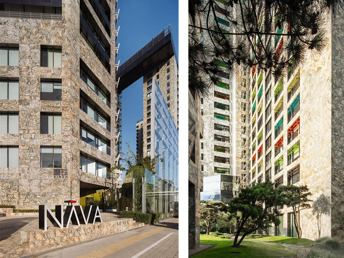
The new office of Motie Group is located in Beijing Vanke NAVA. It is the latest work of architect Jean Nouvel in China: he captured the red, yellow, blue and green elements from the Hexi color painting and designed it into colorful colors on the exterior windows of the building. The louvers make NAVA's louvers the keys to playing the rainbow; he traveled 18,800 kilometers to select the last batch of Brazilian Kamarica rocks in the world... so history, culture, ecology, and art symphony here.
On the guide signs, in order to facilitate the quick arrival of new and old employees, external visitors and other users, the project team has designated workstations, office rooms, meeting rooms, conference rooms, negotiation rooms, brainstorming rooms, open booths, and open negotiation rooms in the office space. Functional areas such as zones are numbered, and users are guided to quickly reach the areas they need to reach through floor guidance, hangtag instructions, wall guidance, etc.
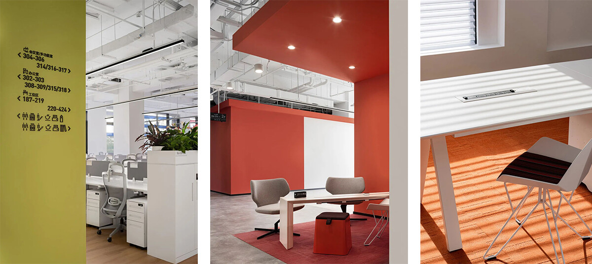
For furniture selection, the project team, designers, and suppliers worked together around the needs of each space, coordinating furniture styles, upholstery, finishes, and colors to balance comfort, function, and the overall interior concept.
02 Poetic ambition — Black
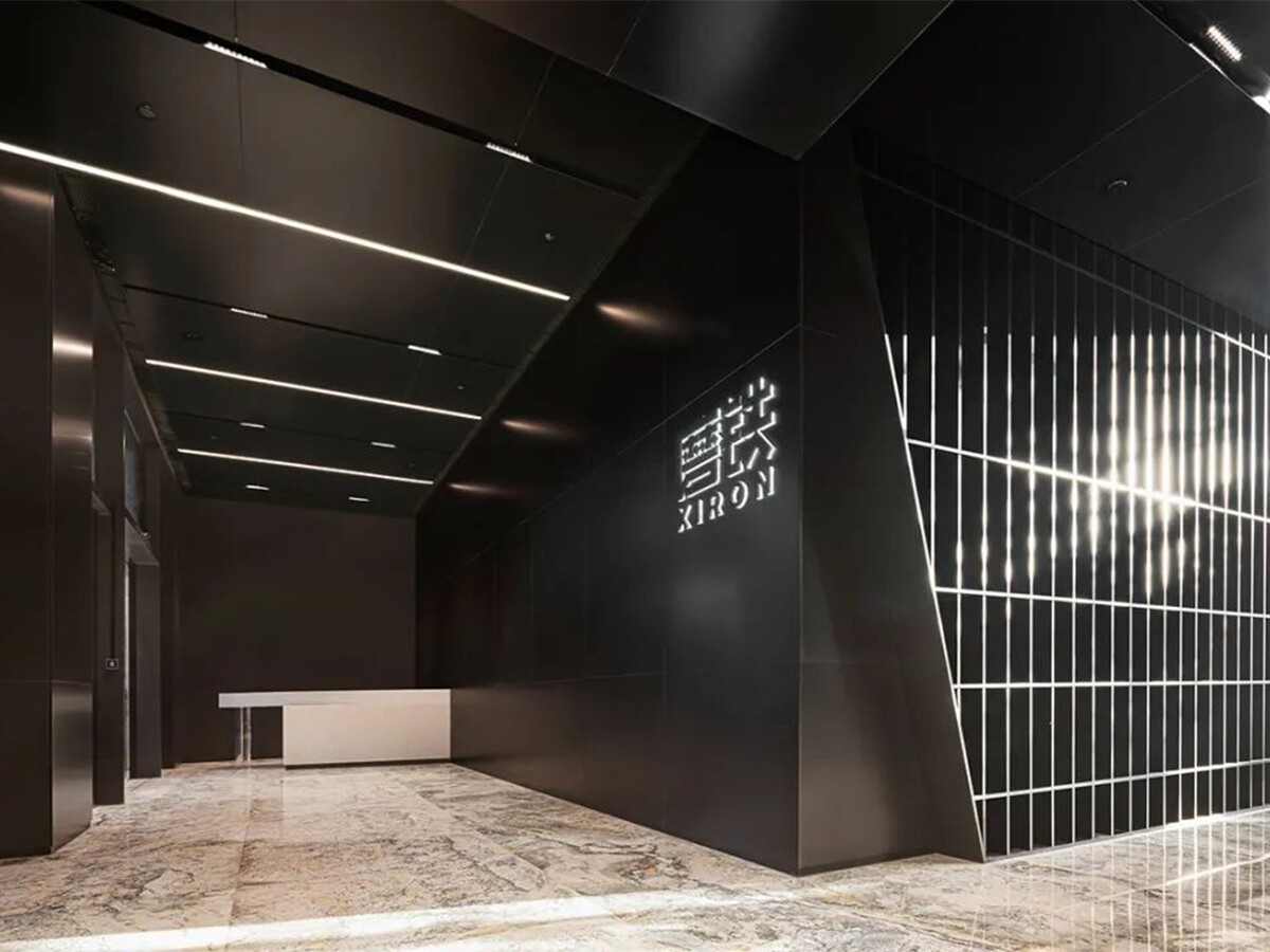
The color tone of the lobby is black. Black represents the land that breeds all things, echoing the main color of Motie Group's logo. Land represents heritage and everything is possible. The project team named the main color of the lobby "Poetic Ambition."
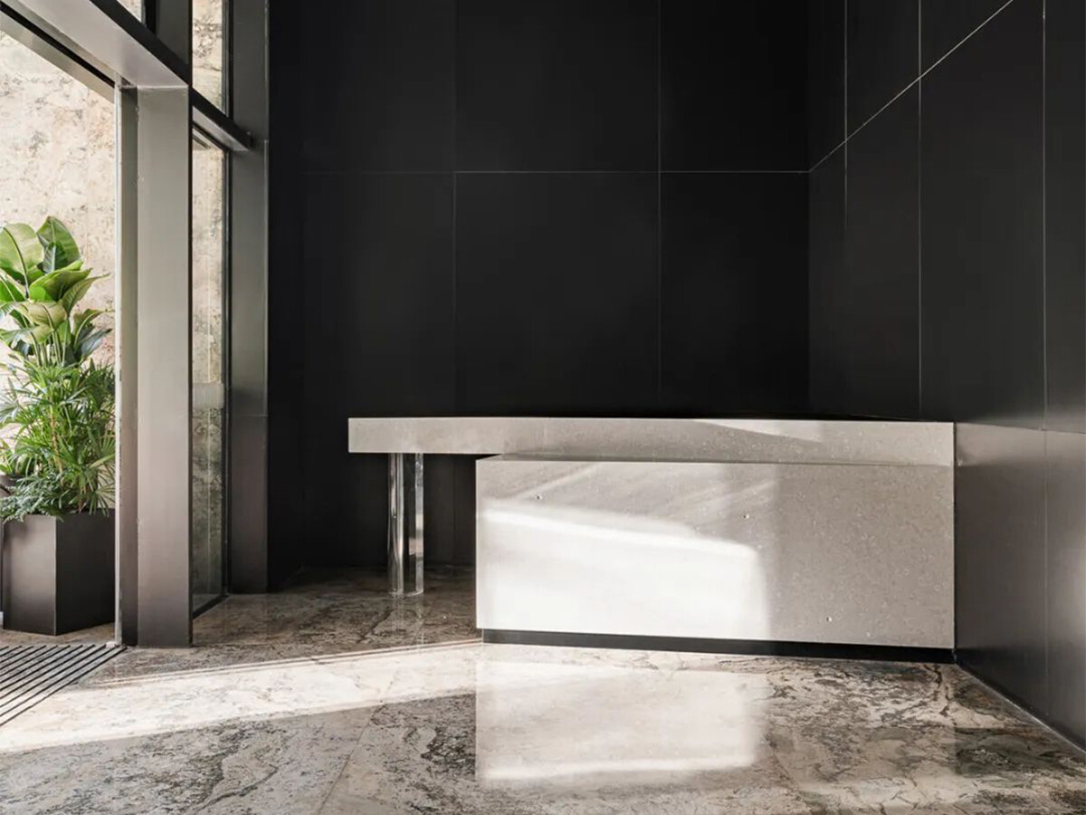
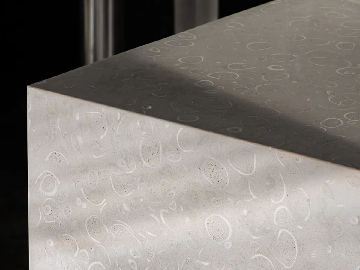
For the selection of materials at the lobby front desk, recycled concrete shell panels with cast-in-place technology were chosen. The concrete of the industrial era was blended with the rustic natural oyster shells. After the surface of the finished stone was polished, the inlaid oyster shells suddenly appeared, symbolizing the radiance of the industrial era. With the light of creativity, the iron grinder is like a wanderer between the mountains and the sea, picking up oyster shells of the times.
03 Surge of passion— Red
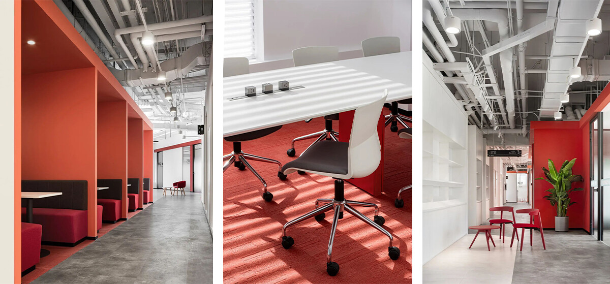
In terms of color use, the main color of the second floor is red. From north to south, four reds in the red series, blush, Roselle, Jinyun, and ocher, are used in order to match different spatial functions to form a red flow in the space. Experience, giving employees aesthetic changes and emotional comfort.
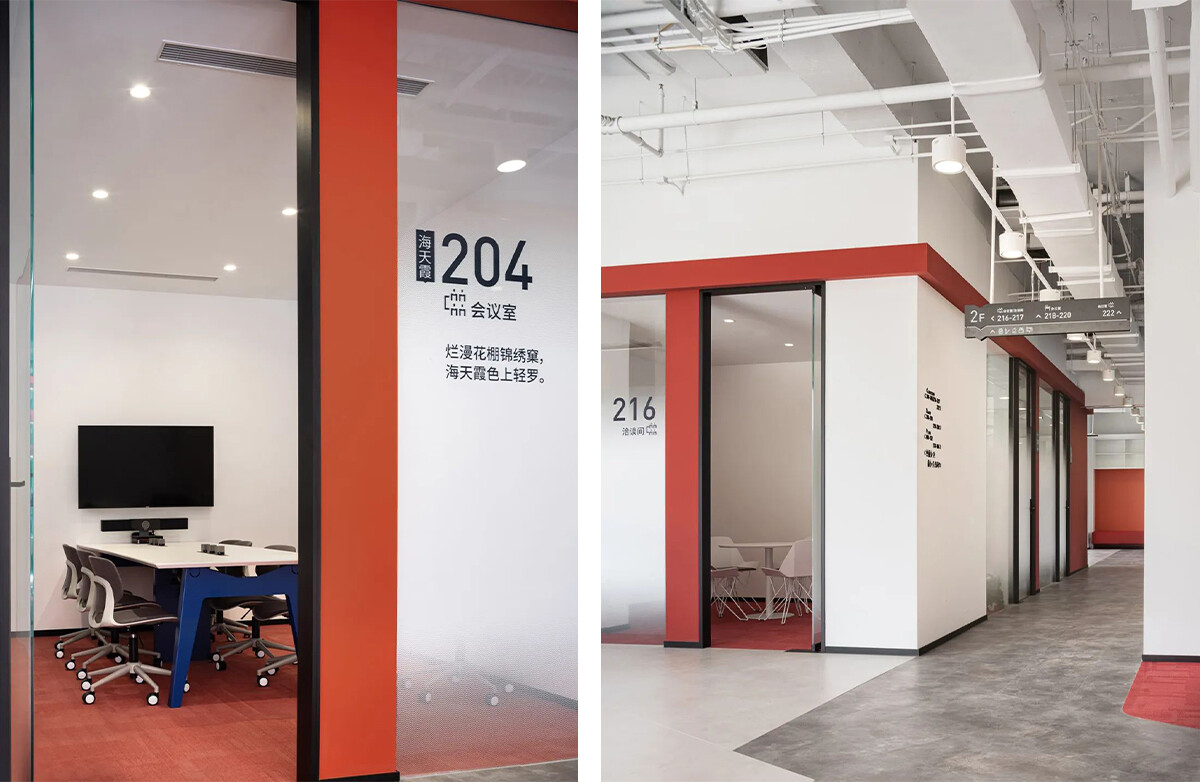
In terms of space and functional layout, the second floor combines enclosed offices and meeting rooms with open discussion areas and booth seating. Formal meetings can take place behind closed doors, while shorter conversations and informal work can move into the open areas nearby. This gives employees more choice without separating each activity into a completely different part of the office.
In the wayfinding signage system, gradient privacy film is used on glass around offices, meeting rooms, and discussion spaces. It screens the areas that need more visual privacy while keeping the upper part of the partition lighter and more transparent.
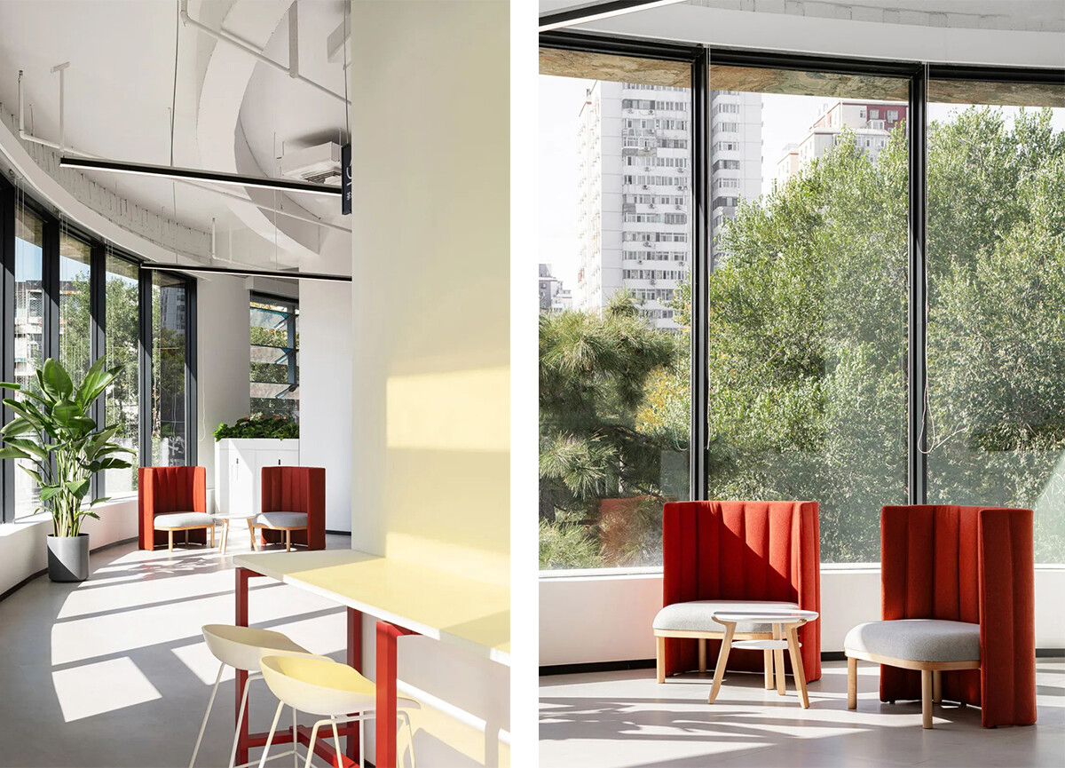
The open tea area can also be used flexibly according to the nature of employees' business. It is equipped with a variety of furniture combinations such as double, multi-person, water bar, informal negotiation, etc. It can be freely combined to meet various usage needs and more effectively improve space utilization.
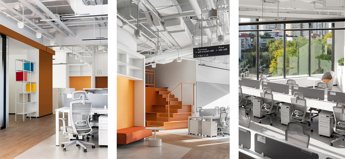
04 vigorous growth— Green
In terms of color application, the main color of the four floors is green, and a progressive color system of ordered shades is used from south to north - Chun Chen, Plum Green, Water Dragon Yin, and Green Shen.
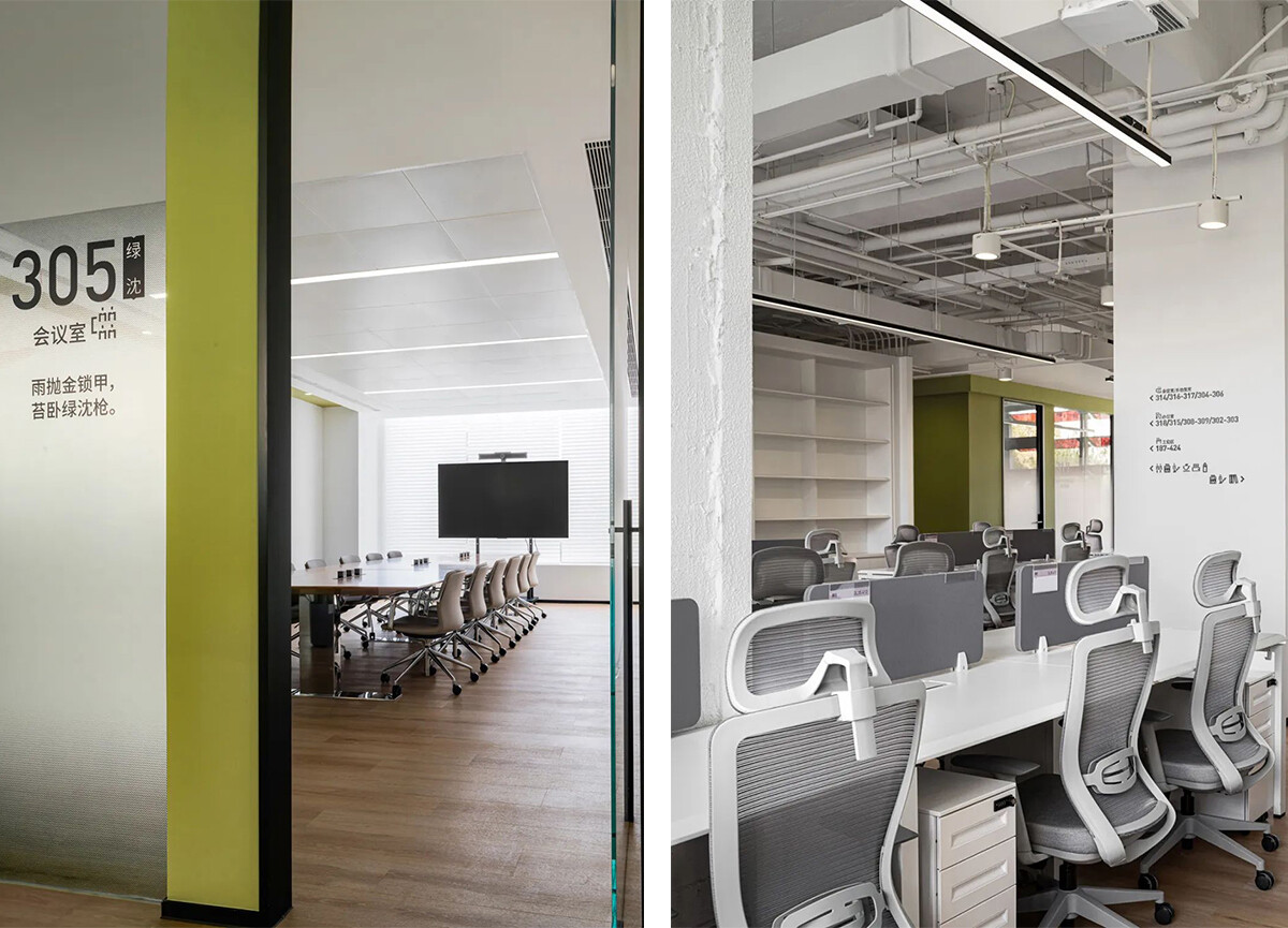
In terms of space and functional layout, a LOFT and open negotiation area are set up on the third floor, which together with the conference room and office rooms form an office space system. Employees can flexibly switch from one way of working to another according to work needs, further blurring the boundaries between working methods and working hours.
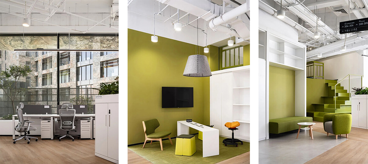
The entire LOFT area is composed of three DuoStudio modules (side-by-side face-to-face working mode), a Maker Commons module (flexible social dialogue working mode), an open ladder reading module and a private space on the second floor (equipped with yoga mats, casual lounge seating, etc.) are combined into a creative space ecosystem.
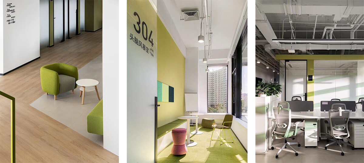
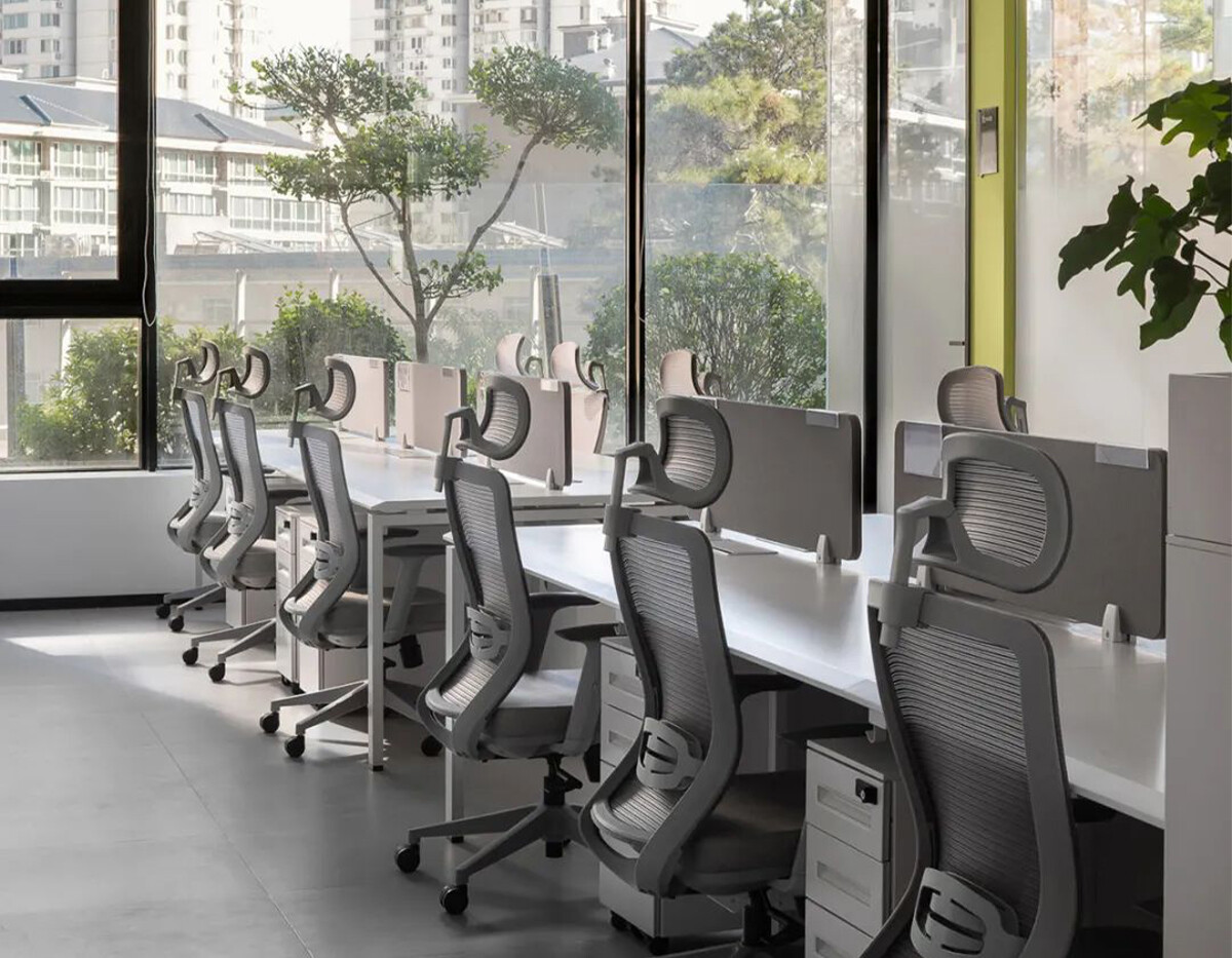
The construction of the ecosystem also depends on the use of the environment. Natural light, indoor planting, and views toward outdoor greenery soften the more structured workstation areas. Together with the green color palette, these elements give the floor a calmer, more relaxed character without changing its main working function.
05 warm sunshine— Orange
The main color of the fourth floor is orange. From south to north, the color gradually changes from amber and orange to amber and Tang tea.
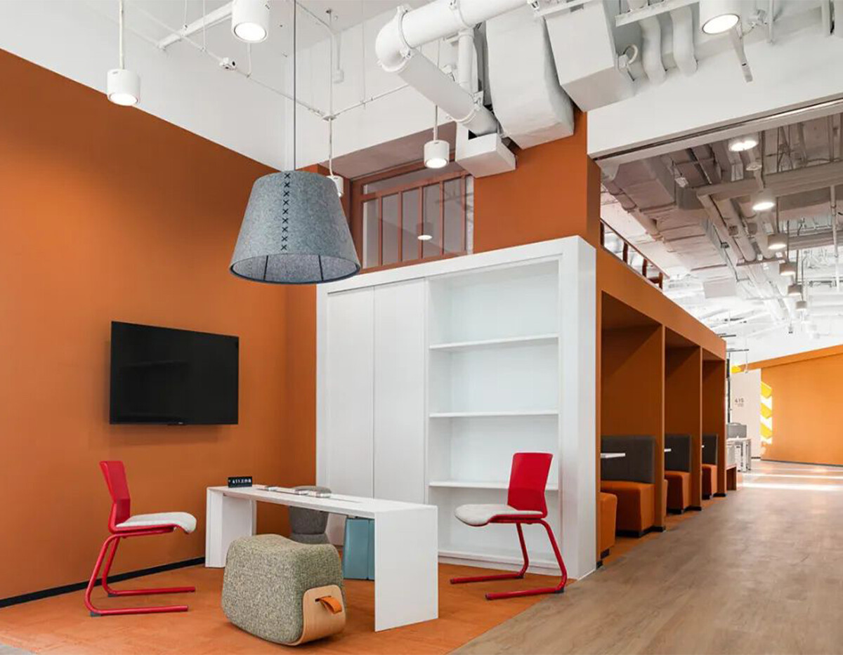
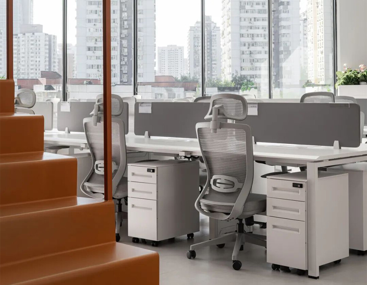
Health and happiness are the core of the design. Orange tones, natural light, and open workstation layouts give this floor a warmer and more energetic character. The color is used alongside neutral workstations and light furniture finishes, so the office remains bright without becoming visually overwhelming.
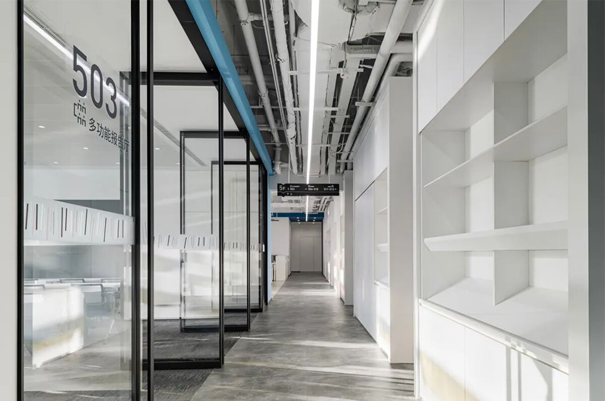
06 Blue Universe— Blue
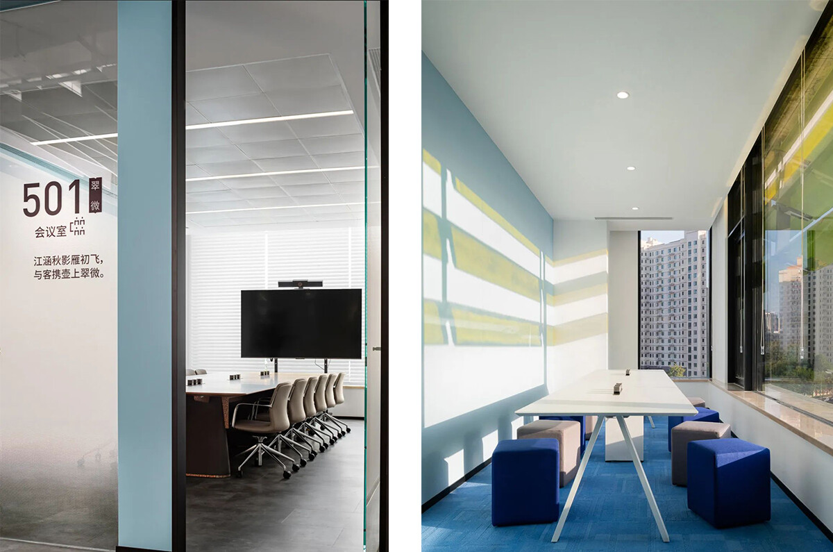
The main color of the fifth floor is blue, with three blue gradient colors of cyan, glazed and emerald from north to south. These colors make people feel as if they are between the sea and the sky, watching the waves burst into different shades of foam in the fresh and cool sea breeze.
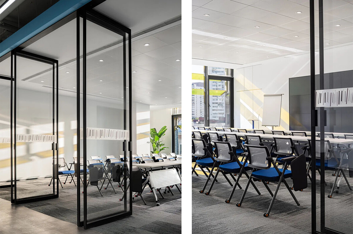
With the completion of the layer-by-layer office ecosystem, a large-scale multi-functional lecture hall equipped with technological supporting facilities is also urgently needed. The design of the lecture hall incorporates design techniques such as volume, array, and change to enhance the value and sophistication of the space and create a ceremonial conference space.
07 What This Office Teaches Us About Color and Space Planning
|
Design Move |
Practical Value |
|
Different color theme by floor |
Makes large workplaces easier to recognize and navigate |
|
Formal + informal work settings |
Gives employees different places for different tasks |
|
Privacy film on glass |
Balances visual screening with openness |
|
Mixed furniture settings |
Supports meetings, short conversations, focus and breaks |
|
Consistent color + furniture planning |
Keeps very different spaces visually connected |
A project does not need 7,500㎡ to use the same thinking. Color, workstation layouts, partitions, lounge furniture, and meeting settings can be coordinated at different scales to give each zone a clearer purpose while keeping the whole office visually connected.
Conclusion
Here, color does much more than decorate the office. It helps each floor feel distinct, while the mix of workstations, meeting rooms, open discussion areas, lounge settings, and shared spaces gives people different ways to use the workplace throughout the day. The result is a large office that feels varied without losing its overall identity. M&W can bring the same balance of color, furniture, and space planning into workplace projects at different scales.